
Icon design guidelines
Style Editor supports replacing the map icons.
Some icon design aspects should be maintained as they are, while others may be implemented more freely. The following documentation is split into sections accordingly: the mandatory icon design guidelines illustrate the mandatory requirements, while the general icon design reference section covers the soft rules behind the default map icon set.
For partial replacement of the map icons it is recommended to follow the design guidelines of the HERE base map icon set. These guidelines are documented below under the icon design reference section.
Note
Please familiarize yourself with the HERE icon licensing terms if you're planning to use HERE icons in any custom manner.
POI Icons
1. Icon shape (mandatory)
Tear drop icons
Has anchor at bottom center ideal for pin-style icons.

Circular icons
Has anchor at center ideal for round icons.

2. View box
Size: 20 x 26 px**
We recommend your svg icon fit within this box for proper scaling and placement.
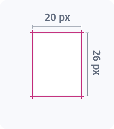
Padding: Minimum 1 px from all sides
Padding is required to prevent the icon from touching the edges. You can add more than 1px for extra spacing.
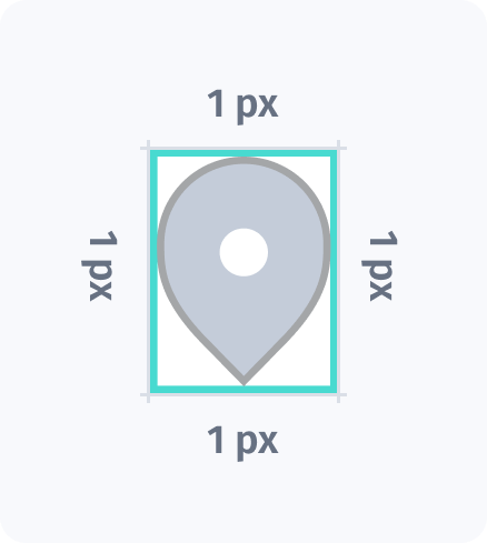
3. Marker & icon styling
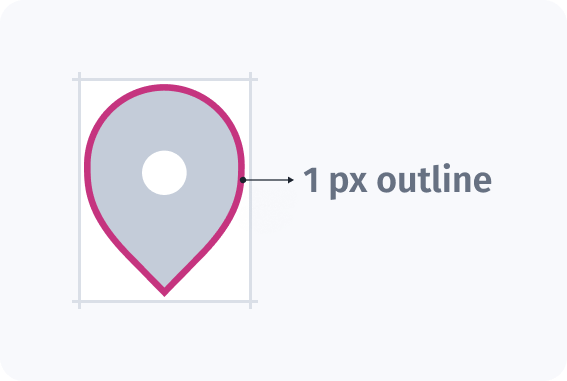
Marker outline (Stroke): 1 px
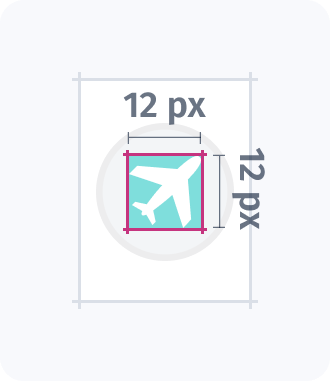
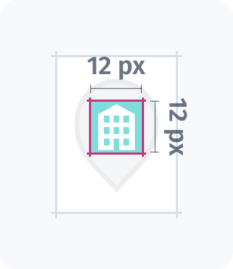
Iconography Size: Maximum 12 x 12 px
Icon element/image inside the marker.
Administrative places
Administrative place icons represent different types of populated areas:
 A white circle for cities
 A white square for regional capitals
 A pink square for national capitals
Their size scales based on population—larger for major cities, smaller for towns and villages—helping users instantly understand the settlement’s importance at a glance.
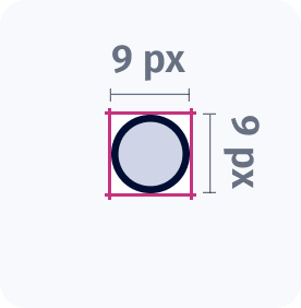
1. Icon styling
Each icon is 9×9 px, including 1 px outline to enhance visibility.
Updated last month