

Basics of map design
Introduction
This guide introduces the principles and practices for designing clear, readable maps in HERE Style Editor.
What is a map?
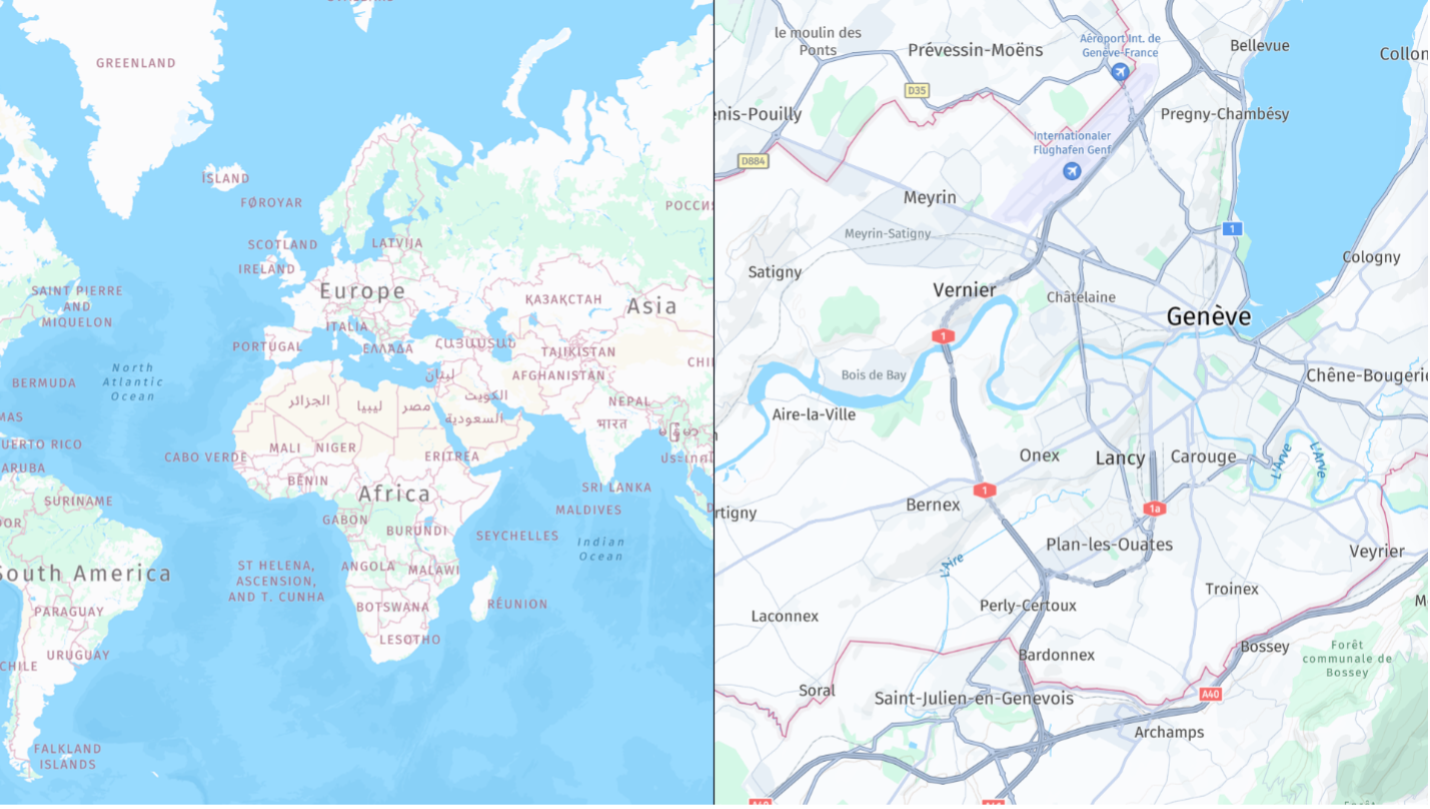
A map is a visual representation of geographic space. It communicates spatial relationships between features such as roads, buildings, terrain, points of interest (POIs), and boundaries.
Maps translate real-world locations into a symbolic format that people can use for navigation, analysis, planning, and decision-making.
Why maps matter
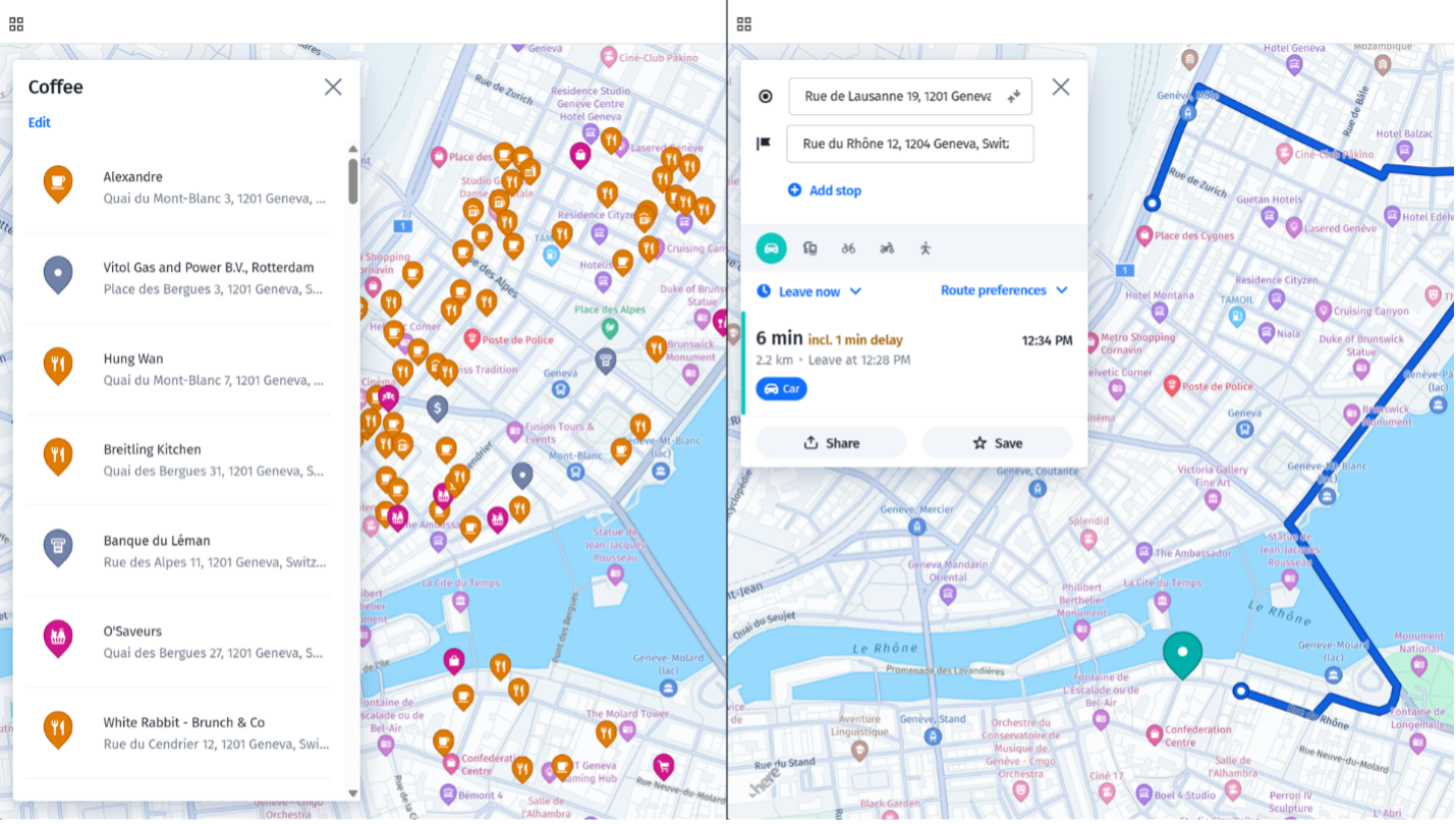
Maps help you:
- Navigate to places and follow routes.
- Make decisions about planning, logistics, infrastructure, and transportation.
- Understand complex geographic data.
- Interpret changing conditions such as traffic, incidents, or weather.
What is map design?
Map design is the process of deciding what geographic information to show and how to represent it. It combines cartography, visual design, data organization, and user experience.
A good map is clear, accurate, purposeful, and appropriate for its intended audience and environment. It emphasizes important information without overwhelming the user.
Static and interactive maps
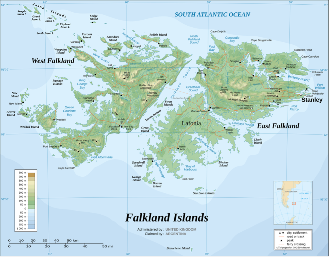
Traditional cartography uses several elements to help people interpret a static map, such as a printed map, PDF, screenshot, or atlas.
Essential elements of static maps
- Title: Communicates the map's subject and purpose.
- Legend: Explains symbols, colors, line styles, and patterns.
- Scale: Describes the relationship between map distances and real-world distances. Use a scale bar to provide a visual reference.
- Orientation: Indicates direction, usually with a north arrow or compass rose.
- Map attributes: Represent roads, transport systems, rivers, cities, and POIs using symbols, colors, and line styles.
- Projection: Represents the Earth's curved, three-dimensional surface on a flat, two-dimensional map. Every projection distorts shape, area, distance, or direction to some degree.
- Purpose: Identifies whether the map is thematic, topographic, navigational, or intended for another use.
- Source and date: Provide data provenance and temporal context.
How interactive maps differ
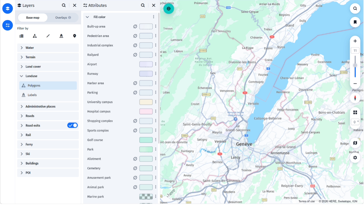
Style Editor produces dynamic maps for automotive, mobile, and web applications. Users interact with these maps instead of reading them as standalone artifacts.
The following suggestions are recommended:
- Use the application interface to provide context instead of embedding a fixed title in the map.
- Use consistent styling and layer organization to make symbols and colors understandable without a persistent legend.
- Do not use a fixed scale bar because the map scale changes as users zoom.
- Support orientation through pan, rotate, and tilt interactions instead of relying on a permanent north arrow.
- Let the platform manage the map projection instead of exposing it to users.
These suggestions do not remove the need for cartographic principles, but can change how you apply them.
Core map design principles
Use the following principles to prioritize, style, and adapt geographic information so maps remain clear and useful across users, devices, and environments.
Visual hierarchy
Use visual hierarchy to show users what to notice first. Prioritize routes, major roads, landmarks, and active alerts with size, color, contrast, and drawing order.
Keep supporting information visible without letting it compete with the primary task.
Color and contrast
Use color to distinguish categories and communicate meaning, not as decoration. Make colors distinguishable for people with color vision deficiencies and across day and night modes.
Use contrast carefully. Excessive contrast makes a map noisy, while insufficient contrast makes important features difficult to find.
Level of detail
Balance completeness with readability. Showing every feature at every zoom level creates clutter and slows interpretation. Reveal detail progressively as users zoom in.
Context and environment
Consider the map use case and display environment. Screen size, resolution, brightness, contrast, surface reflectivity, and viewing distance affect how users perceive colors, labels, and symbols.
Consistency and branding
Apply consistent visual rules across platforms and map modes. Adapt brand colors into map-appropriate tones so they do not reduce readability or conflict with operational overlays.
Understanding map layers
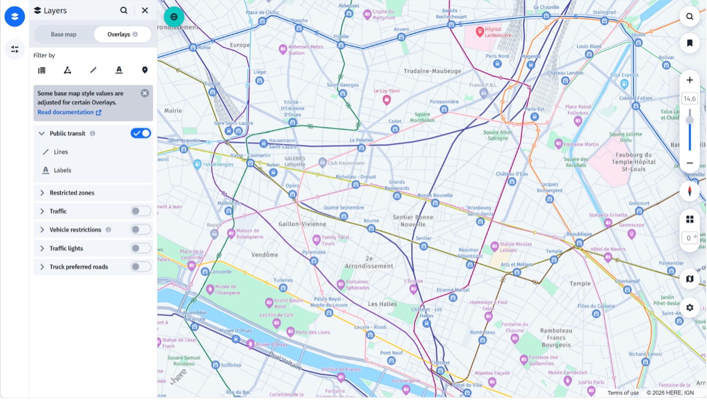
Use layers to organize geographic data. Style each layer according to its role in the user experience.
Layer types
- Base layers: Land, terrain, and water provide geographic context.
- Transportation layers: Roads, highways, railways, and lanes support mobility and navigation.
- POI layers: Places such as fuel stations, EV chargers, and emergency services support search and route planning.
- Dynamic layers: Traffic, incidents, weather, and other changing information provide real-time context.
Layer best practices
Organize by visual importance
Style layers according to the map's purpose. In a navigation map, subdue land and water while emphasizing routes, traffic, and guidance elements.
Maintain drawing order
Use drawing order to control how layers stack visually. Place terrain and land at the base, roads above them, labels above roads for readability, and alerts or guidance elements at the top.
Distinguish icons from labels
Use icons for fast recognition and display them earlier or more prominently when appropriate. Use labels to provide additional context, and introduce them selectively to reduce clutter. Control the visibility, size, color, and contrast of both at each zoom level.
Consider performance
Remove unnecessary data and visual elements to support fast loading, smooth zooming and panning, and consistent rendering across devices.
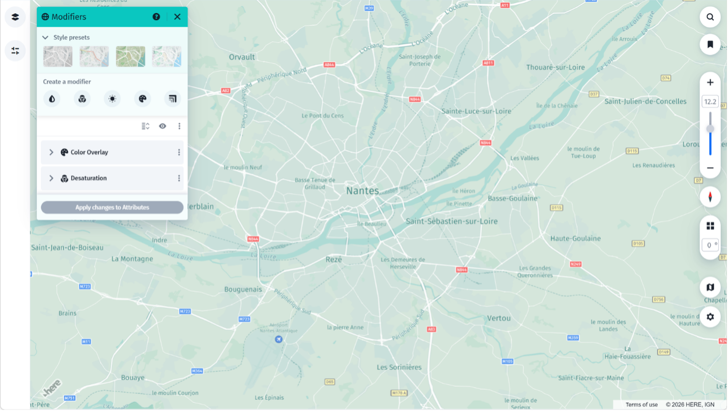
Tip: Group related layers and use modifiers for bulk edits. For example, change the width of several road categories or adjust multiple label layers together.
Zoom levels and cartographic balance
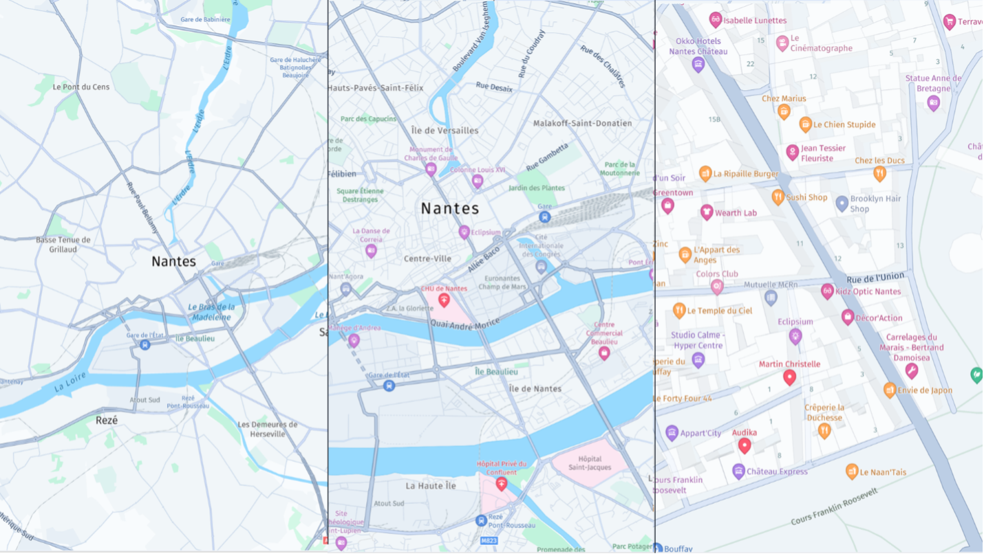
Use zoom levels to control how much information appears at different scales. A well-designed map reveals detail gradually while preserving orientation and visual hierarchy.
Example zoom ranges
These ranges are examples. They might vary by product or data configuration.
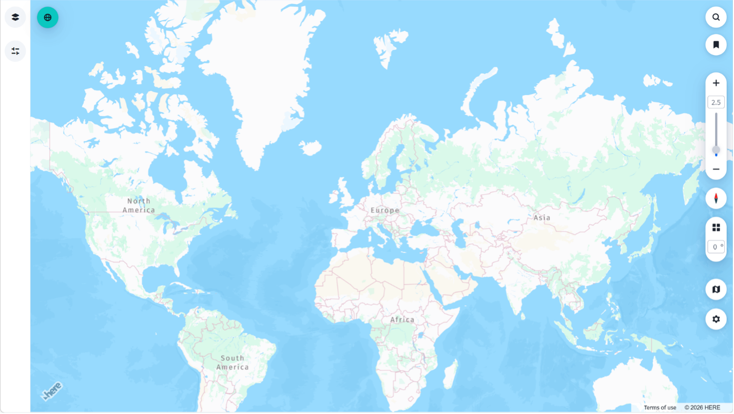
- Global view (ZL 0-5): Continents, countries, and major highways.
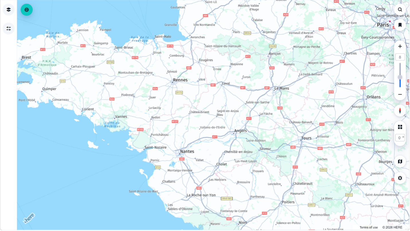
- Regional view (ZL 6-10): Cities, primary roads, rivers, and other major geographic features.
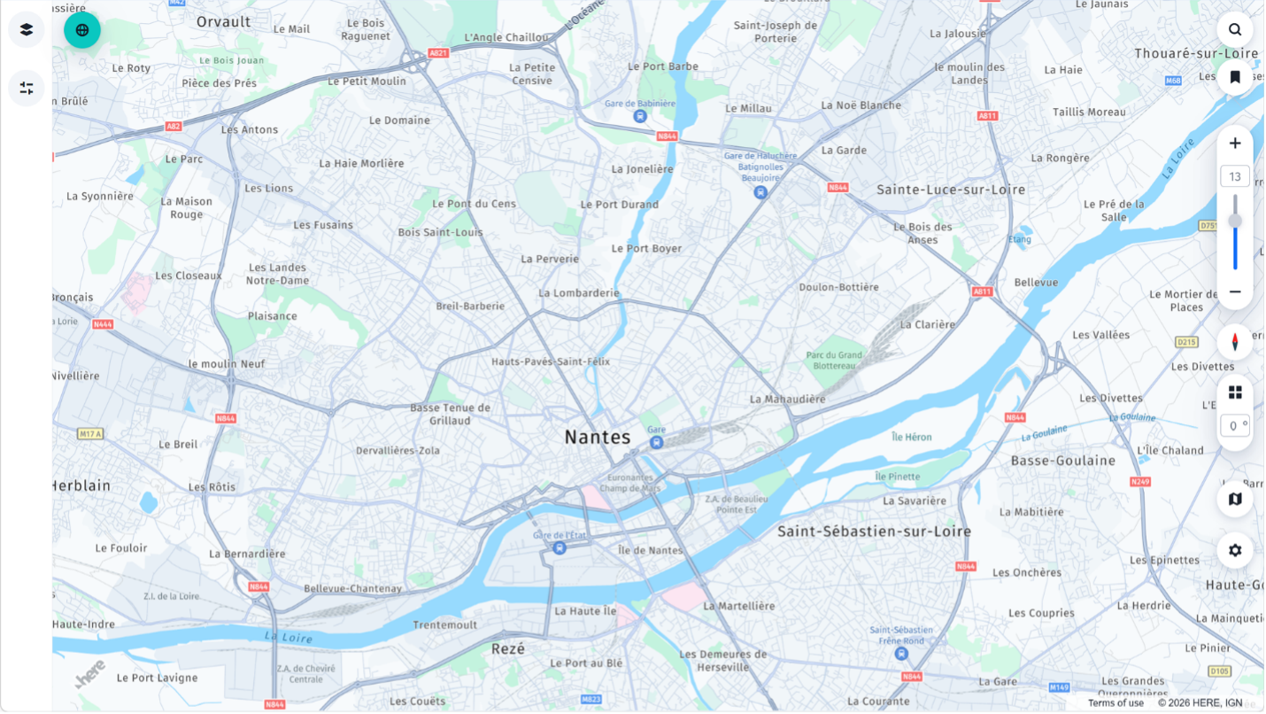
- Local view (ZL 11-15): Secondary roads, POIs, neighborhoods, and building footprints.
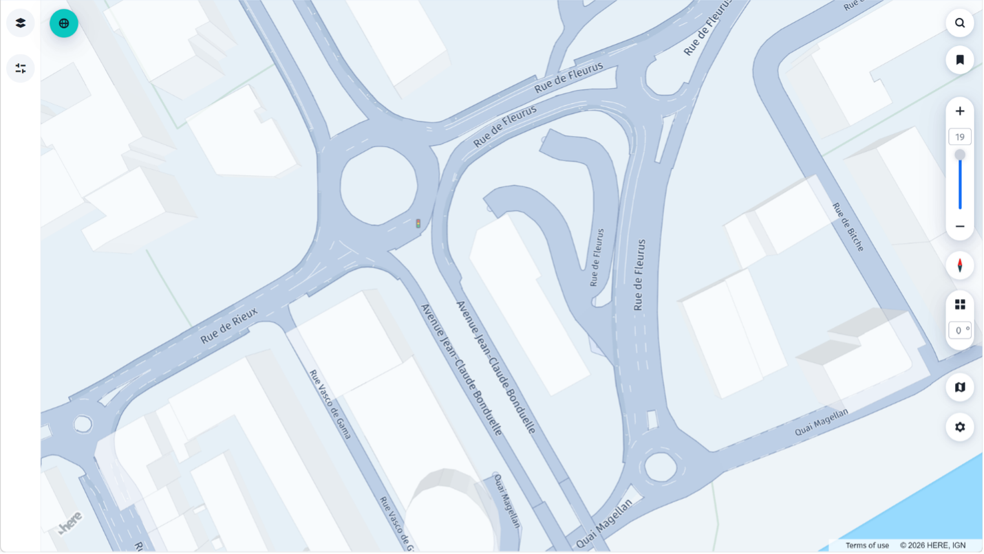
- Lane-level view (ZL 16+): Lane markings, traffic signals, and other detailed navigation context where the data supports it.
Maintaining balance across zoom levels
- Reveal information progressively instead of all at once.
- Scale icons and labels consistently.
- Simplify geometry at lower zoom levels and show more precision at higher zoom levels.
- Keep primary routes visually dominant at every scale.
- Avoid abrupt changes that make the map feel unstable or cause users to lose orientation.
Automotive map design
Design automotive maps for quick-glance comprehension. Drivers should be able to identify the route, important road features, and relevant alerts without searching through visual noise.
Day mode
Design day mode for bright environments and high ambient light. Provide clear contrast without excessive visual intensity.
Night mode
Design night mode for low-light conditions. Reduce glare and eye fatigue while preserving the visual hierarchy and meaning of day mode.
Why context styling matters
Use context-aware styling to:
- Support quick interpretation in changing lighting conditions.
- Maintain consistent meaning across display modes.
- Reduce distraction and improve comfort.
- Help users focus on navigation and driving tasks.
Choose colors for the user's perspective and driving environment, not only for brand identity.
Practical Style Editor guidance
- Limit prominent colors so users can scan the map easily. Choose the number of colors based on the map's purpose and the categories it must communicate.
- Use dash patterns to distinguish line types and reinforce hierarchy, such as for centerlines or boundaries.
- Apply design tokens to keep colors, widths, opacity, and typography consistent across layers and platforms.
- Use responsive styling to keep features usable across screen sizes and viewing conditions.
- Adapt brand colors into muted, map-appropriate tones when necessary.
- Use brand colors carefully on base layers so they do not conflict with traffic, transit, routing, or other operational overlays.
Map design checklist
Refer to the following checklist before publishing a style:
- The map's purpose and primary user task are clear.
- Important features have the strongest visual hierarchy.
- Colors and symbols are distinguishable and accessible.
- Layers are drawn in an order that prevents important information from being obscured.
- Detail is revealed progressively as the user zooms in.
- Icons and labels remain readable without creating clutter.
- The style works in both day and night conditions where applicable.
- The map remains clear across supported screen sizes and zoom levels.
- Rendering remains smooth during zooming, panning, and other interactions.
Updated 9 days ago