

Vehicle Restrictions - Icon design guidelines
Vehicle restriction icons communicate safety-critical information. The base icons combine with various dynamic aspects, such as textual information from data sources, active/inactive statuses and stacking with nearby icons.
While they can be customized, we recommend preserving their core visual characteristics and limiting changes that may affect their recognizability or meaning. Always review customized icons on target devices before deploying them to production.
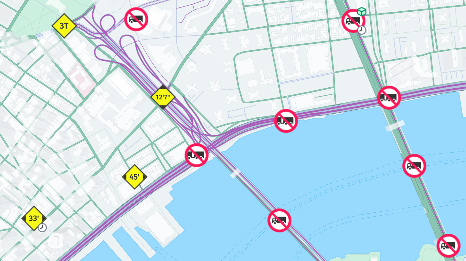
The following guidelines are recommended:
-
Preserve the icon shape
Maintain the circular and diamond silhouettes. These shapes communicate different categories of restrictions and are also used by stacking behavior.
-
Preserve semantic colors
Avoid changing colors that communicate meaning (such as warning or prohibition colors). If possible, limit changes to brightness/contrast.
-
Preserve the content area
Many vehicle restriction icons display dynamically generated values (for example height, width or weight). Leave sufficient empty space for this information and maintain good contrast.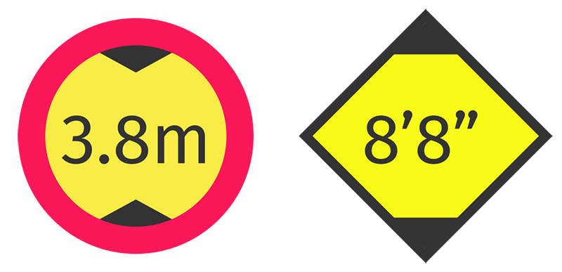
-
Support all icon states
Provide custom artwork for both active and inactive variants. Ensure both remain visually related and easily distinguishable.
-
Allow for overlays and stacking
Restriction icons may display additional badges or appear in stacked form when multiple restrictions exist. Avoid designs that interfere with overlays or rely on artwork extending beyond the icon boundary.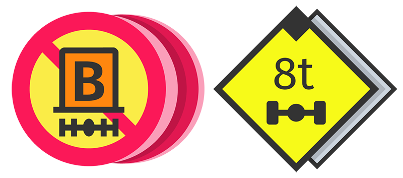
-
Test before deployment
Any edits to the vehicle restriction icons should be thoroughly verified with use case scenarios on the map view. Attention should be paid to aspects such as readability of icon severity marker colors and readability of icons obtaining their content from map data.
Updated 24 days ago