Using MapCreator's feature "What's on the map" to easily display categories of information
How to Use MapCreator’s “What’s on the map” Feature
to Display Categories of Information
| |
| --- |
| Summary Use MapCreator’s “What’s on the map” feature to display information such as speed-limits or speed-category using different colors for different values. The toolbar buttons are located in the lower-left corner, the field appears at the top center of the display, and the legend shows the colors and their corresponding values. |
Applies To
==========
HERE MapCreator
Visual display of categories of information
Examples such as speed-limits and speed-category
Before You Start
================
Open MapCreator and navigate to the area you want to inspect.
Make sure the map is not zoomed out too far. The “What’s on the map” field only appears when the map is sufficiently zoomed in.
Procedure
=========
Locate the toolbar buttons in the lower-left corner of the screen.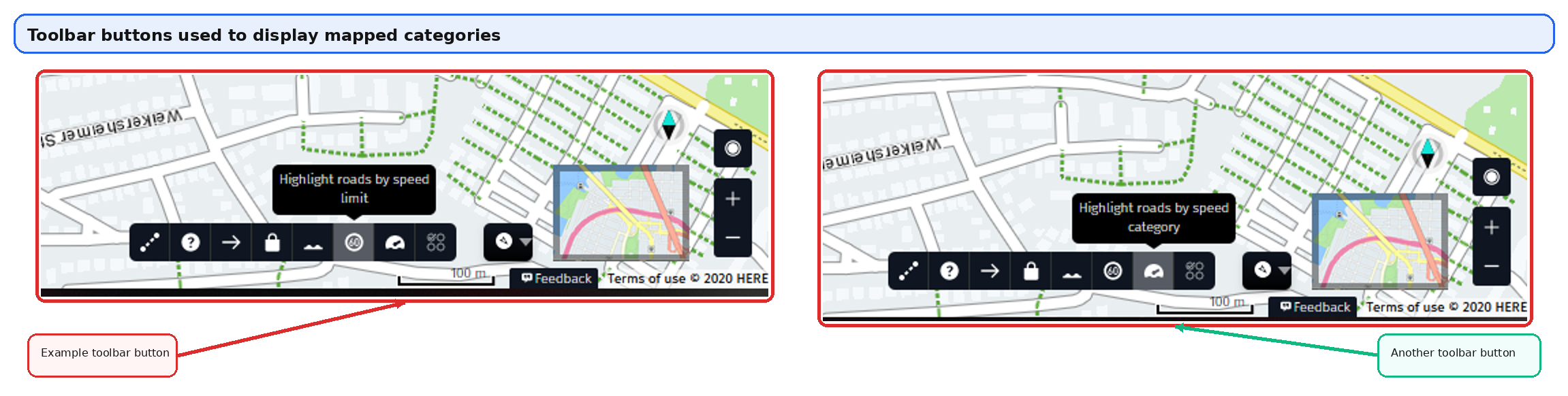
Figure 1. Toolbar buttons used to display categories of information
Select the relevant toolbar button to color the geometry according to the chosen topic.
Look at the top center of the display for the “What’s on the map” field.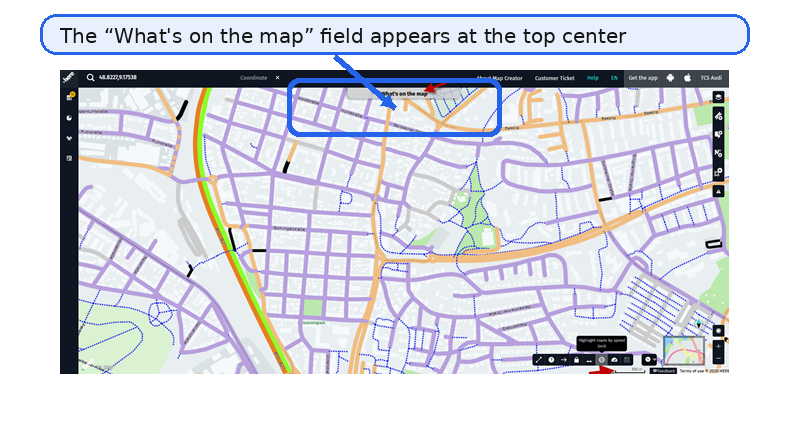
Figure 2. “What’s on the map” field at the top center of the display
Click the field to open the legend that shows the colors and their corresponding values.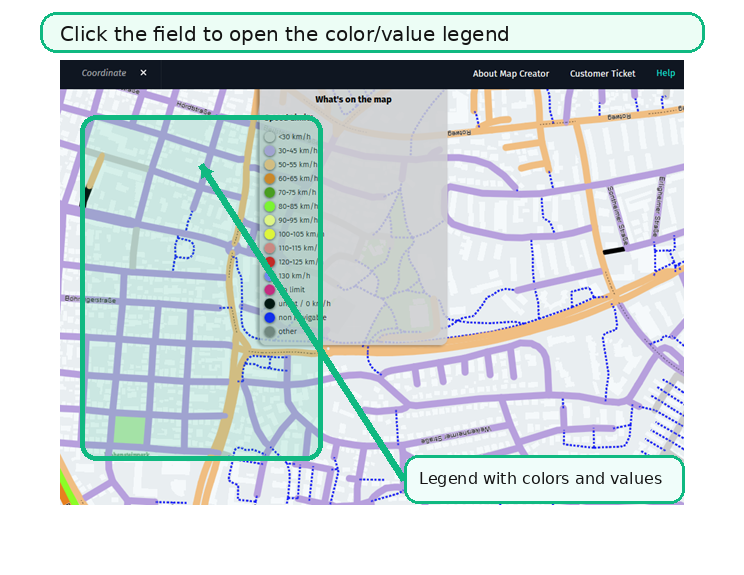
Figure 3. Legend showing colors and corresponding values
Result
======
The map displays the selected category using colors. By opening the legend, you can match each color to its corresponding value.
Notes
=====
The article is intentionally limited to information available in the original source document.
The callouts and highlights in the figures are visual aids added to improve readability for external KB publication.